

Optimize your site, get people searching and buying your products quicker.
Optimizing a website is an important, but often ignored step of website creation. We all know what a good website looks like when we see one, and in this article I will go over five major areas in which you can optimize to turn your website from good to great.
Website prototyping
Designing fast wireframes and in detail mockups in days rather than weeks allows you to fully test out your website without spending precious resources on long winded development. This way, you have a tangible website, or webpage to work with in no time at all. By prototyping, you can test your homepage and product pages, while also ensuring your checkout process and general navigation is where you want it. This can happen in a short amount of time, allowing companies to spend more time and resources into actually creating the website.
Using a prototyping tool can save ecommerce websites time by allowing you to quickly design wireframes, start testing and creating detailed mockup designs. These tools often have ready made component libraries with animations and transitions for even more detailed prototyping. Buttons, content panels, switches, charts and more can all be drag and dropped onto a page to create a prototype website in only a few minutes.
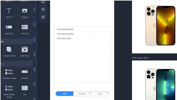
Source: Mockplus
Once you have customized your components you can create a landing page, product page, checkout page and more in a matter of hours. Developing these pages has a barrier to entry, only specialists can develop a landing page or product page with code, but with prototyping tools anyone can design them. As a result, you can start testing your shop, work on the user navigation and optimize your store.
I like to use Mockplus and Adobe XD to create prototypes. On Mockplus, the huge built-in library of ready made components mentioned earlier, helps me save time by not having to create every single component from scratch every time I want to create a page.With either platform, the relevant code (for Web, iOS or Android) is generated for your prototype components allowing fast and accurate implementation by developers. This UX design consultancy has the best UX designers to make your choice easier.
Early user testing
Now you have quickly created a webpage or website mockup. The time you have saved from quickly creating this should be used in testing and iterating your website through A/B testing with target audiences and stakeholders, along with further blind testing.
When testing, there are areas in your website where you can see it is slow, or where you slow down their process (buying a product). Test and make sure you don’t have any unnecessary slow downs. Create landing pages, CTA pages and buttons, product pages and checkouts. Then optimize every small process to ensure there is no delay in going from the homepage to buying a product.
A/B testing is also very important to test a variety of designs to find out which page is more optimal for target groups and customers. Give two or more designs to different groups, and collect data such as time spent on the page, time spent to go from searching to finding a product, time spent going through checkout and more. This in depth analysis can help you optimize your website and ensure no sale is lost.
By prototyping and doing this user testing, you get real, actionable data to help iterate and refine your ecommerce store, allowing you to get ahead of the competition. Even with minimal development on the real pages, you are already making massive progress on your store.
Work on navigation
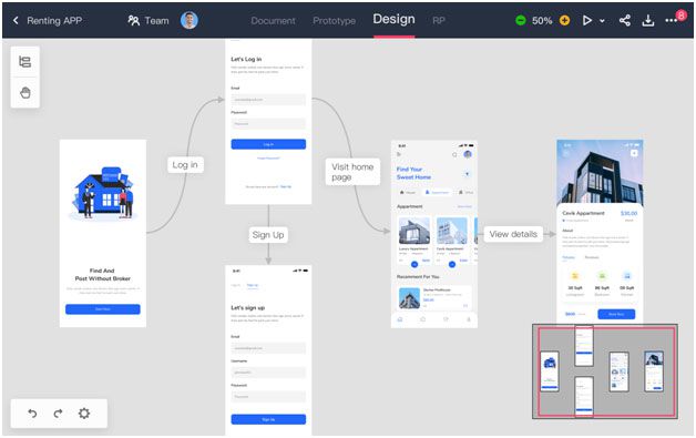
In addition to testing specific pages and groups of pages, ecommerce stores need to test navigation and customer flow. At this early stage don’t worry about in-depth page architectures – this is all about ensuring customers follow the path you want them to follow. For example: homepage – search/categories – product page – checkout. By optimizing the navigation on a surface level you reduce any inefficiencies and ensure users remain focused on the product.
You should focus on:
Links:
Check that every link off a page is useful and prominent. Don’t have any distracting links, they can take away from your ultimate goal. Any distracting links can take users off the ideal path.
Checking your page links on a storyboard allows you to blind test user flows – by restricting the choices you can keep in check specific routes a user can take. Users can then only go from A to B through designated choices. With this data you can find further inefficiencies and adapt them to how users see your website. Every website has their own overall flow but looking at it from above, on a full-view storyboard, allows you to find inconsistencies and areas to optimize.
Back button:
Ensure your back button on every page acts how you want it to act. Keep it natural. This impacts heavily on the user experience in stores because people often browse going back and forth between search and product pages.
Testing these out helps ensure users go through your website exactly how you want.
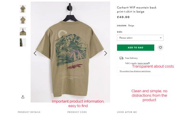
Use successful ecommerce stores as templates
Amazon, Asos and Macy’s are fast, image rich and focused. They don’t distract the user when shopping and get users to find and purchase products quickly and regularly. Each of these stores have personalized products pages and don’t use regular generic information. The information is presented in a nice, brand specific way.
Source: ASOS
The same can be done on your website. Personalize the website and make sure every product has good product information, make sure they are image rich but focused on guiding the user to checkout without distractions. Make sure you stand out from the crowd – do analysis on your competitors and make sure your website information is more informative and of better quality than other stores that appear alongside your site on Google Shopping or on the Google search page.
You can do this on your website too. Personalize the product and make sure every product page has good information – make sure the images are full resolution while you guide the user through the website with minimal distractions. This can help you stand out from the crowd. By having more information, or more detailed information than competitors, it is easy to attract new customers.
Optimize for mobile
By the end of 2021, it was estimated that mobile ecommerce customers will account for 53.9% of all customers (Statista). It is vital that your store is optimized for fast shopping on a phone in order to find this market. By not optimizing well for mobile customers, you are potentially losing an estimated 63% of mobile customers who abandon a website due to poor usability.
Large problems arise when websites don’t adapt for touch users. The way a mouse interacts with a computer is very different to how a user interacts with a touch screen – the interfaces are completely different. On a computer you can rely on mouse hovering or the keyboard to quickly input text while on a touch screen, users will tap once and type slowly on touch keyboards. These differences need to be understood and taken into account.
This goes further into areas of the ecommerce store such as refining searches, checkout, navigating categories and sub-categories. The optimization needed is deep, but can truly transform your website for mobile users.
Two areas to highlight:
Address lookup
Getting mobile users through the checkout process is key. Any reason for a user to go off the webpage and they will – when it comes to mobile shopping, a long form filled with typing can often do that. To combat this, have an address lookup tool for users to quickly enter only one line or part of their address for the website to then fill in.
Apple or Google pay
Again, filling out payment information can be time consuming and any way of combating a potential abandoned cart can help increase conversions. By having Apple and Google Pay, users don’t need to enter any information, they just verify the transaction and quickly check out.
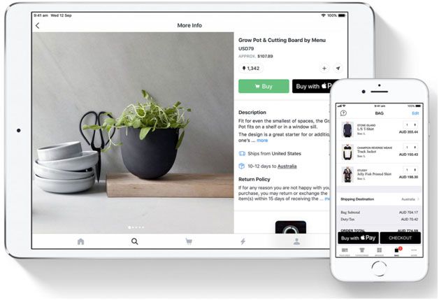
Source: Apple
These might seem like small examples, but they are important. Mobile optimization can have hugely positive impacts on your ecommerce store’s usability and competitiveness.
Other areas to consider for mobile optimization: selecting categories and sub-categories, since users won’t use a mouse, hover interactions with categories will not be useful and a user touching the screen several times to find their category can be annoying. Filter refinements also have massive potential for optimization, since again, users won’t be using a mouse, so selecting several checkboxes to filter requirements can be tedious. Finding solutions for your store can take time, but prototyping them out helps you find real solutions, fast.
")