

We’ve all been there when we have to manually redline our designs so developers know exactly what our perfect designs are actually showing, we have even tried sending over source files for our devs to use when implementing. But isn’t there a better way of sending over detailed design information? There are ways we can make markups easier and a way of disseminating this information quicker and more efficiently. This is of the utmost importance, if a developer doesn’t have all the information in front of them they will not spend precious time digging around for important information, a good handoff is a detailed project with information to hand or directly on top of the designs for quick implementation.
This is a full guide on how to detail everything important and ensure you give your developer every important piece of information that you can for them to implement your designs as best they can.
The main goal is to allow your developer to be as close to 100% independent of you as possible. If there are any decisions to be made during development then the developer can make them with appropriate confidence in getting the choice correct.
Many designers still only send source files or upload designs to Figma or Mockplus to let the dev check specs. There are, however, additional steps we can take to ensure a smooth handoff and implementation. I have written below about key areas in which designers need to concentrate on when preparing a handoff document. These touch on the main aspects of a design and at the core of this article, I preach spending more time making obvious but important markups that allow the developer to not search out for design information.
Fundamentals – fonts, specific manual specs, distance, regional markups, color, user flows, spacings. Interactions. Reference sheet.
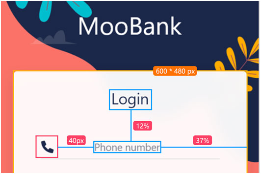
Common design details need to be consistent across your app or design. Spacings need to be consistent, different text styles need to be clear, the user flow has to be laid out clearly from the start. These are items we as designers come across frequently that are easy to overlook but need to be consistently marked across the app, otherwise, our finished product might look messy and be less impactful on target users. Not only for us in the designing stage, but we also need to clearly markup what common design choices we have made for our developer to carry that over to the developed app.
Fundamental specs
Writing these down is especially important in helping to reduce the likelihood of errors, such as mistakes in the pixels, needing the dev to round up or down to a certain value for example.
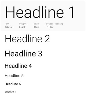
Material Design font style example
Icons – meaning of icons and their actions.
To
better help developers create the most useful and accessible app, include an
icons page in your design to explain meanings and uses. For example, if there
is an icon for “download” without text, explain this tag, and where it should
be included, and reference the link page.
Including this page ensures the developer understands the importance of these
icons and their addition to buttons creating a secondary action.
States – page, button states.
Page states can vary depending on what type of page is being shown. The loading page state, empty page state, error state, success state, interactive state (for inputting data), and more. In doing so this reduces the likelihood of the dev encountering such page states and as a result reduces the chances of a dev not implementing a proper solution to an empty page, for example.
Button states are incredibly important parts of how a user interacts with an app or page. Whether this button is a hover or pressed button, or enable or disable – there needs to be bounds to each button and the developer needs to know the bounds so they can distinguish each button’s behavior and consequent actions. This is especially important because states are high-level elements – features the user interacts with frequently and need to be implemented correctly.
Adobe XD: Designing States for Buttons & UI Interactions
Every product is different, but having common states for the engineer to fall back on is useful to copy and paste consistent pages throughout the app. Working out every single page and button state is important so the developer can keep their work streamlined and not need to come back to you to figure out a new state.
Colors and meaning – warnings, alerts, confirmation.
This is more than just a color palette, this is regarding the main “traffic lights” in a product. Every product needs a color system, whether that’s for positive, negative outcomes or errors. There are common colors in a project and need to be explained to the developer in case there are other states that the designer hasn’t planned for and the developer can independently implement the correct color.
To further reduce errors in implementation, include your primary, secondary and tertiary colors. Include any dark mode variants. Rather than using hex units, specify in your design system the various colors you have, so for example rather than #FC8EAC, you have “Light Pink”.
Design system – shortcuts, references.
This is related to other sections, but it’s important for every designer to utilize their design system to combat any misunderstandings or complex data – such as hex values.
Similar to the hex values above, try to create shortcuts for any text label you have in your design system. Custom labels allow quick implementation. Create shortcuts and keywords for as much as you can to help reduce errors in copying names and labels of elements in the design system. Also look to create common buttons and to put brand assets in the DS.
Resources – documents and links.
Use a detailed PRD that links directly to your design so you can check your work against your PRD regularly. The PM will be happy to sign off if they see everything has been implemented correctly. The dev will also then be an
Another benefit of having a resource area where a PRD and other resources are kept is that important links are kept in one place. This is important for referencing resources such as a link to a specific component’s implementation. This can be done either in a reference tool or by commenting directly on the design with a link to the reference.
Communication – commenting and task management.
Task management on Mockplus
No matter how hard you try to completely hand off your project to your dev, they will never be 100% independent, you will need to talk to them as new issues arise. That’s okay. The best you can do is use integrated commenting and task management systems where you both give each other specific tasks that are linked to artboards, or comment directly on an aspect of design that needs clarification or a rethink.
This all goes back to consistency, ease of implementation and communication. Having a free-flowing, integrated commenting and task management system, team members are able to efficiently continue working on the project while waiting for comments or tasks to be reviewed.
Summary
All of these design details need to be communicated to the developer so you don’t destroy all of your hard work by not doing the handoff properly. A poor handoff can destroy a project. Remember – the developer isn’t designing the app, they are creating it, and your job is to ensure they can use your design to create it as best they can. If they are spending time frequently going over details with you, the project will be delayed and they will not implement everything as you intended. That’s when mistakes happen, either miscommunication through email or text, or simple wrong implementation. Spending the time to actually mark up important details that you want implemented correctly ensures more accurate implementation and a more successful product launch.
")