
Fonts, or typefaces, have become an integral part of communication regardless of the medium. Typography, as an art and science, has evolved significantly over the years and has become an essential element of design projects. With many different types of fonts available, it can be overwhelming to choose the best one to use. In this article, we will explore the differences between two common font styles, Roman and cursive fonts, and which one is best to use for your design project. Hopefully this article can provide you with a clear distinction on which font to use.
Sans serif fonts, Serif fonts or Cursive fonts what is a Roman font?
Roman fonts, also known as serif fonts, are named after their origins in ancient Rome. A serif is the small line or projection found at the end of a letterform’s stroke. Roman fonts have a clean and classic look that makes them suitable for projects that require a formal appearance. Times New Roman, Garamond, Baskerville, and Georgia are examples of popular Roman fonts. These fonts can be used in body text, headers, and titles, as they offer excellent legibility and readability. Roman fonts are also versatile and can be used in many different design projects, including web design templates and graphic design.
Personally, I use these fonts for all types of documents, letterhead and even for emails. There’s a reason it’s a world standard.
What is a cursive font?
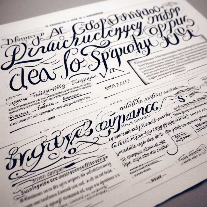
On the other hand, cursive fonts, also known as script typefaces, imitate the fluid curves of handwriting and calligraphy. Cursive fonts are ideal for projects that require a more elegant and sophisticated look. Calligraphic and script fonts have thin strokes and elaborate flourishes that make them best for invitations, wedding announcements, and logos. The italic style of the cursive font is popularly used for short texts, quotes, and captions. In contrast, the bold style is used for headings and titles. Cursive fonts are also known for their expressive feel and are commonly associated with French and English styles of writing. Some examples of popular cursive fonts are Calibri, Futura, and Monospace font.
Personally, I’ve seen these fonts used more for it’s elegance. While old-style serif fonts are clean, sometimes you want something a little more fancy than roman fonts. Gothic, latin and german fonts in cursive work great on wedding invitations and other formal invite stationary.
The key difference between Roman and cursive fonts is their style of letterforms.
A letterform is the design of an individual letter. Roman fonts are built with straight lines and sharp edges, while cursive fonts are built with flowing lines and curves. Roman fonts have serifs, which make them more formal and traditional.
In contrast, cursive fonts have a more informal and artistic appearance. Another difference between Roman and cursive fonts is their origin. Roman fonts were primarily used during the Renaissance, while cursive fonts were developed during the Gothic period.
Things to consider for graphic design
When considering the right font style to use for your design project, keep in mind the purpose and needs of your project. If you need a font that is easy to read, legible, and versatile, use serif like a Roman font like Helvetica or Arial may be your best bet. Suppose you want a font that is more decorative, elegant, and expressive. In that case, a cursive font like Baskerville, Calibri, or Futura is a better choice.
Choosing the right font style is an essential aspect of design projects. It can affect the legibility, readability, and overall feel of your project. Knowing the differences between Roman and cursive fonts can help you choose the right one for your tiny home design project. Whether you need a formal and traditional font style or an expressive, elegant, and artistic one, understanding typography and type design can help you make the right choice. Consider factors like the purpose and needs of your project and use the appropriate font style to enhance the overall look of your design.
FAQs
What is the Roman Style of Font and what are it’s characteristics?
The Roman style of font, also known as old-style or humanist font, is a typeface that originated in ancient Rome and has evolved over time. It is characterized by its elegant and classic design, often used for formal and professional purposes.
Characteristics of Roman Fonts
Roman fonts are typically sans serif, meaning they do not have the small lines or strokes at the ends of each letter. This gives them a clean and simple appearance, making them easy to read on screens and in print.
These fonts also have a balanced and harmonious design, with varying line weights that give them a natural and hand-written feel. The letters are often slightly slanted, adding to their fluidity and grace.
Why is Times New Roman Standard for Microsoft and Other Tools?
Times New Roman is a timeless, classic font that has been used for centuries. It was designed by Stanley Morison in 1931 for the British newspaper, The Times, hence its name. However, it was not until 1932 when Monotype Corporation released the font commercially that it gained widespread popularity.
In the 20th century, printing technology was rapidly advancing, and there was a need for a new font that could withstand the high-speed presses. Times New Roman quickly proved to be a reliable choice due to its crisp, clean lines and legibility at small sizes, especially in lowercase. It became the standard font for many newspapers, magazines, and books.

Namaste UI collaborates closely with clients to develop tailored guest posting strategies that align with their unique goals and target audiences. Their commitment to delivering high-quality, niche-specific content ensures that each guest post not only meets but exceeds the expectations of both clients and the hosting platforms. Connect with us on social media for the latest updates on guest posting trends, outreach strategies, and digital marketing tips. For any types of guest posting services, contact us on info[at]namasteui.com.