

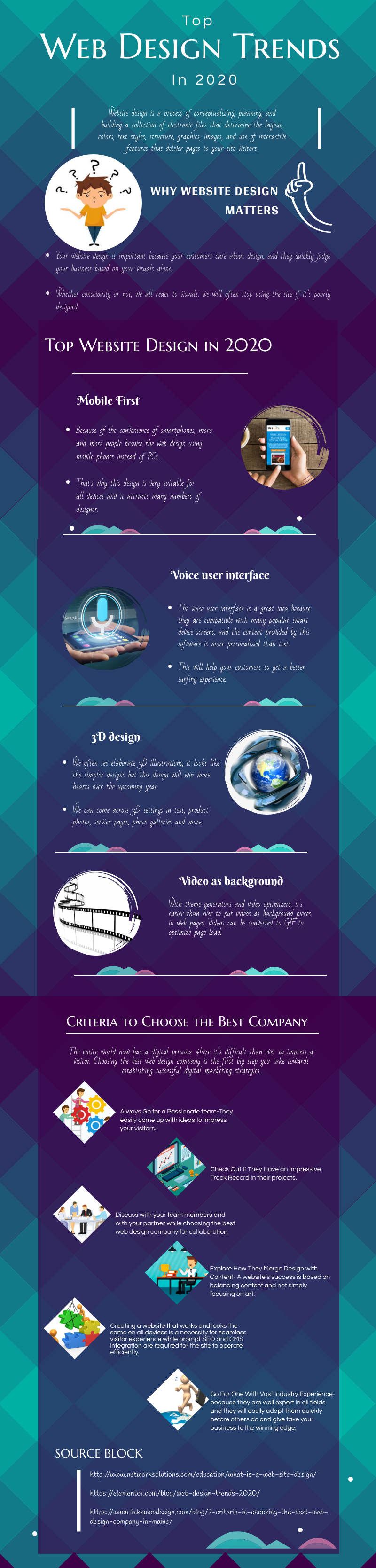
The number of websites is growing every year. More and more companies are investing in making the website their full-fledged showcase. Therefore, it is increasingly difficult to stand out and you need to be up to date with trends so that our web design is considered modern.
Responsiveness, responsiveness, responsiveness
In times of intuitive CMS, having a website that is not mobile-friendly is unthinkable. Especially that the percentage of site views on devices such as smartphones or tablets is constantly increasing. Many people even give up using laptops, because most of the functions have the latest phone models. Therefore, under developing your site for RWD in 2020 will be shameful and will undoubtedly result in a high bounce rate.
Not only that, but the next rule of creating websites should also be that the pages will be designed first for the mobile view and then for the desktop version.
What does it mean? The site is to be primarily attractive on phones, and not just designed also. Until now, it often looked like many elements disappeared from the mobile version, as long as the website in terms of responsiveness, however, responded. Now it seems that the situation will reverse – the desktop page will be created based on how the site will look on mobile devices.
Light websites
Web design will also be light in terms of the weight of the website. Page load time has a clear impact not only on Google’s search engine algorithms but also on the bounce rate. If the user has to wait a few seconds for the site to fully load, he will likely leave immediately. This is an undesirable situation, so you should avoid it and make sure that the website loads quickly.
How to do it? Optimization and minification of graphic materials seem to be a must. Just like the limit on the number of plugins or add-ons, which we often add without any consideration or restrictions. Optimization also applies to CSS itself or even tracking codes – it’s better to use Google Tag Manager instead of throwing a few additional lines into the code. All this can have a huge impact on how quickly a website starts up.
The role of photos and video
Although you need to take care of the weight of these materials regularly, you can not opt-out of them at the same time. It is becoming more and more common for a website not to read the content but to view it. In this respect, the impact of YouTube or Instagram is huge. Therefore, the basic principle of creating websites should be an appropriate selection of graphics. The more different types of multimedia materials, and above all engaging and interesting content, the better for our site and recipient.
Can your page scroll by touch?
It is also a matter of time when scrolling by touch will become an indisputable principle of creating websites. After all, these are not only mobile devices but also many laptops with the latest software allow this type of browsing. For the user, this is intuitive, which is why you must allow this option. It is worth taking this into account at the very beginning of the page design so that later there are no unpleasant surprises when coding.
Extinction sliders
Users have noticed not only banner blindness, but also slider blindness. Over the last few years, photo sliders with short headers or passwords have become so popular that they were simply in the minds of users. Therefore, it should not surprise anyone that the design of pages will slowly depart from this type of function. User experience research indicates that many of the recipients immediately scroll to the next section of the page, completely paying no attention to photos or texts. And it is UX and user satisfaction that is the basic principle of creating web design.
Minimalism
Sometimes less is more. And this golden rule also applies to web design and should also be used in 2020. Therefore, with ornaments and additional elements, there is no need to exaggerate, because they are not always the things that users expect.
So what will be fashionable? Appropriate font selection (in a limited number), typography and spacing only, a limited number of colors, often monochrome. These single treatments mean that the website can be received for a premium website, which in turn in most cases has a positive effect on brand positioning. At the same time, minimalism will also be useful in the field of mobile-first – such a design is much easier to adapt and optimize for mobile devices.
Will these trends apply throughout 2020?
Unfortunately, it can’t be assumed. Trends change all the time, so you need to keep your finger on the pulse and, if possible, prepare a site that can be easily modified. Because web design is currently one of the fastest-growing branches of marketing and creating websites.
")