
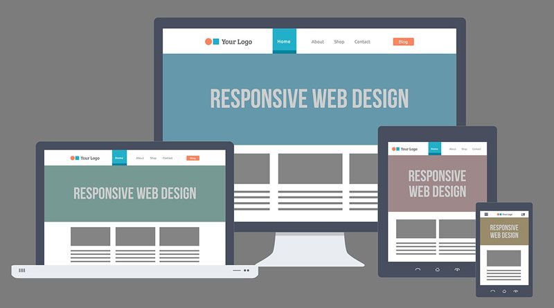
Due to advancement in technology and enhancement in users engagement, website designers are compelled to think about their presence across the globe. The trend of using desktop supporting design has changed, everyone has started preferring responsive design. The mobile responsive design plays the most important role in enhancing the value of a business.
Importance of responsive designs:
- The cost of creating the countless version of a website will be controlled by using responsive design.
- It is highly beneficial to use responsive designs for your website because it can increase the number of visitors.
- Responsive designs are the integrated version of a mobile and desktop supporting website.
- Compatible with varied browser.
Multiple techniques are there to handle responsive designs navigation. Let’s discuss some of them:
Hidden menus can be used effectively
These are the self-sliding menu and the most preferable option for the designers. Hidden menus open by using a toggle switch that is located on the top of the page. It is accessible through every browser but it creates an effect in CSS3 using transitions.
Try to build images of different sizes
When you have the desire to run your site on different devices, you should create graphics according to that. By doing it, the loading of your website can be minimized and the design can be easily opened on multiple devices depending on the screen size.
Choosing Select menu approach helps in navigation
It is the most used approach by the designers for navigational purpose. Select menu is suitable for any browser and it can convert a menu list into a select element. These menus work efficiently for responsive web designs. It removes the excessive navigation links which may create trouble in getting the best results. Every mobile browser handles these select menus in their own way.
Implement a drop-down menu
You should use the drop-down menu for the navigation of the responsive design. It is perfect because it keeps the link hidden till the user does not want to access it.
Sub-links are equally important
For efficient responsive designs, using sub-links is essential. It facilitates multi-level hierarchy. Your system can work smoothly even if there would be multiple links to handle a responsive navigation.
Apply Minimalist approach
As the name suggests, you need to do minimum work on navigation elements. This approach ensures smooth and clean work within a short duration. It is highly beneficial to those organizations who want to promote selected specifications of their site. The main motive of the minimalist approach is to do the adjustment of a site according to the size of the website screen. It can make the navigation link shorter and fit it into the page without getting into trouble.
Use Always off canvas method
It is the most used method by the websites. It is the most successful method to take care of navigation. “Always off canvas” methods will allow you to push the limits with the design.
Keep the navigation menu at the bottom of the website page
It would be great if you embed the navigation menu in the footer of the website page. It will compel the user to first visit your site and then, they can decide what to see next. It could be the best technique to handle navigation in responsive design.
Conclusion
A number of techniques that have been discussed here to handle navigation in responsive designs. If you have navigation issue associated with your site, you can control that by applying all methods. These guidelines can take you to the right path for building a clean and easily accessible navigation menu.