
Material design is all about the UI of the app. Material design is an integral chunk of the app designing and you cannot deny that. Even when an app has astounding and impressive features, with bad looks users are not going to fall for the app. So, use material design in your app and turn your ways to make your app look bold and beautiful and invite more and more users to it. There are several different aspects to be taken care of while designing an Android app, let’s see how material design works for it.
1) Create Surfaces by Using Elevations
While choosing the layout of the material design, don’t forget to refer the guidelines. The layout you pick must be in accordance with the guidelines. The process of choosing the layout of the Android app starts with creating shadows. While using material design, you can create shadows by using elevation. For setting the elevations appropriately on the surfaces, make use of the elevation attribute. Keep this tip in mind: higher the elevation you keep more will be the effect of the shadow cast.
2) Integrate a FAB (Floating Action Button)
FAB is a colored circular button. This will float above all of your content. Now, if you want to integrate any call to action button, then this is the perfect element of material design to use. The elevation of FAB is quite high and hence it floats above all other contents of your app. The size and elevation are standard, they are available in between 40 to 56dp diameters and the elevation is generally kept between 6dp, which can increase up to 12dp if it is pressed. The question here for the mobile app design company is that how to integrate this floating button in the Android app? Well, you are lucky enough as Android Studio comes with an inbuilt feature of FAB. Implementing it depends upon the version of Android Studio you are using. Having a design library will make implementing material design quite easily.
3) Scroll Events
Scrolling is one of the integral chunks you can’t take your eyes off from. The majority of the Google’s material depends upon the Coordinator layout design and you can explore plenty of ways to implement it. Scrolling effect will make use of the expanding and collapsing toolbar which will give great effect to the Android app.
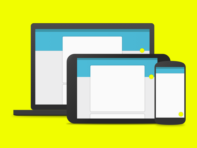
4) Color Palettes of Material Design
Colors are the most enticing things in an app. They are the luring factors as well as the distinguishable factors. For example, this can help you say whether the fruit is ripe or not. It also helps the users prioritize the things. Bold and attractive colors are assigned to the essential elements and less catchy colors are added to the elements which are not to be focused. Material design entails the color tools and color palettes which will help the designers in fast and easy UI designing.
5) Primary and Secondary Colors
The primary color is the one which appears most frequently in your app and the components therein. It’s mandatory to pick a primary color which signifies the brand and the personality of the app. To make the recognized easily, you can use the primary color in the app bar. While Android app development, you can make use of different shades of similar color to distinguish between the elements.
Coming to secondary colors, it is used to accent various parts of the UI. It’s basically a more saturated color and design to drive attention to the specific elements which are basically floating action buttons. These colors are most probably used for headlines, links, progress bar, sliders, button, and button text.