

Designing a mobile UX design needs a slightly different skillset, mindset, and rulebook than for the desktop. Things that works on a PC might not function on a mobile device in a similar manner. With mobile UX design as the prime focus, we have devised a list of 10 key rules.
A brilliant mobile UX design needs equal measure of creative and technology to take shape. While it is true that creativity is an important cog in the machine, technology has also helped it improve. Acuity Training has created this infographic which explores this aspect further.
Now let’s
Cut Out The Clutter
What is the biggest enemy of a good design? Clutter. It is bad enough for a website or a desktop application, but on a smartphone, it is going to be 100 times worse. Unnecessary elements and text cluttering the UI is the last thing you want.
To declutter, try to incorporate icons instead of text. If the icons are not obvious, then you might need to use text as well. Make use of progressive disclosure to showcase key content and controls, with a choice to view more. In short, if you can get rid of it, then you should get rid of it.
Focus On The Primary User Goals
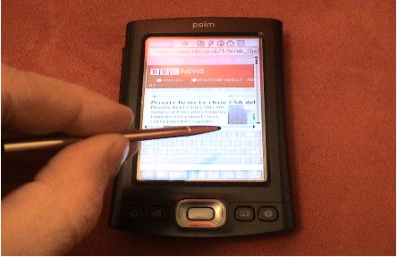
(Palm PDA)
In Mobile Ux Design, one of the most important things is to focus on the goals of the user. The best example for this will be the device known as Palm PDA. It was a forerunner to what is known as smartphones today. They even published a guide for designing applications for Palm PDA called the Zen of Palm ebook. Even though more than a decade old, the guide is still packed with advice that is relevant today.
So how do you focus on the user goals? In the guide released by Palm, they have compared the Desktop to an SUV and a mobile device to a sports car. Like the sports car, an application made for the mobile platform should be lightweight. It should be nimble, focused, stripped-down and most necessarily quick. You don’t want mobile applications bloated with unnecessary features as they are comparatively small, and duration of use will be shorter.
What is your user trying to accomplish? Example – He or she might be looking to find a restaurant, getting the times for the next train or checking the weather. Do ample research focus on the user goals that you have identified. Don’t be distracted and don’t try to fit in features that will not be of use on a mobile device.
Minimize The Need For Typing
Until our fingertips evolve into stylus nibs, typing will remain a painful and slow process. So, the need to minimize typing is very high. If possible let the users tap more than type. Smart features like postcode lookup, autocomplete, etc. can be incorporated so that users only need to enter the minimum amount of information. The personal details and addresses should be remembered. The ‘show password’ option can also be included as users will make fewer mistakes.
Break Tasks Into Bite Sized Pieces
One of the well established Mobile Ux Design principles is breaking tasks into bite-sized pieces. For mobile designs, it is even more important as you don’t want the user confused because of its complexity. Do not replicate the same steps that one might have to encounter in a desktop application. Each level should be focused and straightforward. It doesn’t matter if the mobile version has a couple of steps more than the desktop one, what is important is whether the mobile experience is enjoyable or not.
Don’t Just Port From Desktop
You might get many requests asking to design a mobile app in a very short notice. Many clients would wonder why you can’t take the existing desktop design and just make it work on the mobile device.
But, shoehorning a desktop design into a smartphone application is an awful idea. The result will be a design that will look bad on mobile because it was not designed with a smartphone or a similar device in mind. The differences are too much. The input methods are different as we mostly use a mouse for the desktop while we use the touch for a smartphone.
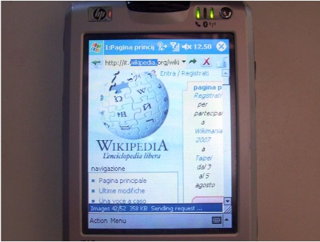
(Wikipedia website on a Microsoft Pocket PC)
The screen sizes are different as smartphones, or similar devices will have a smaller screen size compared to desktops. Duration of use will also be different as smartphones witness bursts and on the contrary, desktops get prolonged use. The context of use is also different as we carry our smartphones everywhere we go including the loo. The first interface of Microsoft Pocket PC is the best example to show that porting a desktop device is not the best way to go forward.
Hand Positions Should Influence The Placement Of Controls
Grip and hand position should determine how you place the controls on your mobile design. The common actions should be put where it will be easier for the user to reach and functions such as delete and edit can be kept in areas which will be difficult for the users to contact. This way, users won’t accidently tap on it. But, it is always necessary to have an undo option for deletion as well. It is crucial to trial the ergonomics of your design with a range of mobile devices and people. You can learn a lot and acquire feedback by seeing how people interact with your design on their respective devices.
Take Advantage Of Mobile Capabilities
Your cell phone has a lot of features and it’s time to reap the benefits of these functions to give the users a great experience. Example – the phone’s digital camera can be used to automatically read unique codes or credit card numbers thus making the process easier. Even though you might not want to go overboard; it is certainly worth it if you can merge technology and creativity to enrich overall design.
Make Everything Bigger Than It Would Be On Desktop
Bigger buttons, bigger text, bigger controls, bigger line spacing, bigger everything. But, why? The design should support poor eyesight and fat fingers as well. Users are sure to use the device outdoors, and the screen will be hard to read in those situations. Many users might be using it while on the move where it’s hard to read tiny text. The users will be using their thumbs more than their fingers and screens are not as sharp as you think it might be when it comes to response. Yes, bigger is not always the better, but in the case of mobile UIs, it is.
Test, Test, And Test More
Testing doesn’t mean just trying the design on your device to see whether it crashes. Instead also reach out to real users to perform practical tasks to see how solid your design is. Prototyping tools like Invision, Proto.io and Axure are incredibly quick and make the process of creating a prototype easier.
Create A Seamless Experience
What do Spotify, Amazon, and Facebook have in common? Apart from being market leaders in their respective niches, they also identified how crucial it is to provide a seamless experience for their users. For example – In the case of Spotify, if you set up one playlist on your desktop, it is instantly available on the mobile device. The experience of the UI is as important for the users as other features of the design are.
Adhere to the tips listed above to get a robust mobile UX design. Keep in mind that a cell phone is a different realm compared to a desktop even though they talk the same language of 1s and 0s.