
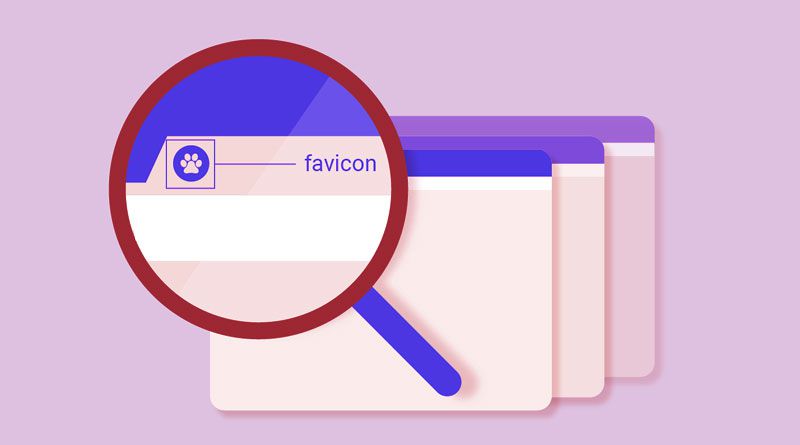
Sometimes the most obvious things hide in plain sight, and this is very applicable to favicons. Unlike large icons, this small icon serves a few purposes but mostly what it does is it helps people find the pages they are looking for quicker. This is a simple 16 x 16 pixel image that works as branding for your site. Favicons are best kept simple – they are ideal to use as basic images or up to three characters of text. Sometimes, a great favicon is a smaller part of the company’s logo. Not sure of what one looks like? Think of the Gmail “M” that’s in the top left corner of your tab, and there is your favicon.
The favicon may seem like something really simple and to the inexperienced web designer, it could be something overlooked or thrown away. However, the favicons serve a lot of different purposes aside from a simple branding extension. A good favicon can do a lot of things, so if you are making your own favicon or just using part of an existing logo, it is important to understand how to leverage this small item’s usefulness.
The Importance of Favicons
The biggest reason that favicons are important is that they make your site have the look of a legitimate business. This is a simple way to boost your branding and your potential customers view the favicon as just more evidence that your company is trustworthy. This is the website’s visual marker and whether searching through your favorites or just trying to find the right tab, the favicon is the easy way to make sure that your brand is easily visually identified.
Favicons and SEO
While favicons do not have a direct impact on your site’s SEO, they are a great tool for improving search engine rankings. There are some simple reasons for this. With a favicon appearing on your history archives, browser tabs, and your bookmarks, this gives your site easy identification and users are more likely to click on it and spend time on the site. This leads to greater impact on your SEO strategy even though the favicon does not offer a direct benefit.
There are some other clear benefits to your SEO as well. Chrome marks for different search ranking criteria and sites that lack a favicon are not as simple to bookmark. The more a site gets bookmarked, the better it does on search engine rankings. The reason why this is important is a favicon allows a site to stand out on a list of bookmarks. The more a site stands out on a list of bookmarks, the better it does because people are more likely to click it. Think of the visual contrast between a bookmarked site with a favicon versus a bookmarked site that is just a line of text. As for branding, your site has greater credibility with a favicon, meaning people will be more likely to click on it; this is something else that helps your SEO.
Making Your Own Favicon
So now that it’s clear the benefits of a favicon, what exactly constitutes a proper one? There are some clear ways to make sure when you create a favicon, that your efforts don’t go unrewarded. There are several things to consider. The ultimate goal is producing a favicon that people visiting your site will identify with. This is a brand extension, so just like your logo, take some time to really consider all parts of it.
The first thing you must deal with the space allowed by a favicon. Remember, this is a 16 x 16 icon. The reason is that all browsers accept favicons of this size. Going smaller does not make much sense, and going larger gets you locked out of other browsers. If your favicon is not appearing on these browsers, your SEO is indirectly affected.
Another important factor is simplicity. Having a design that’s simple allows you to use the whole 16 x 16 space while avoiding the clutter that would arise from just shrinking your logo. Colors and contrast are important too. Make sure the colors catch the eye and stand out – a messy favicon goes unnoticed mostly but when it is noticed, it is a bad reflection on the brand.
Just like your logo tells the story of your brand, so does the favicon. But it does so on a smaller scale. Think about YouTube’s favicon of a red rectangle with the play button in the middle. This tells users everything that they need to know about YouTube and what it does. Your icon should be similarly powerful. If you are taking the significant part of your logo and turning it into a favicon, this is a great way to do so. If your logo has a wordmark and an icon, using the icon is the way to go.
Abbreviating is also a simple way of creating a good favicon. A great example of this is the Facebook “F” favicon. Facebook’s primary color is blue, so a blue field with the “F” in their font is a simple but effective way of letting people know their brand. The Wikipedia “W” is another effective example of using abbreviation. Make sure your font is consistent along with your color. The best abbreviations use the most prominent color of your brand and the first letter of your company’s name.
Contrasting colors is important too. Contrast is easily picked up by the eye, so a clear representation using color and contrast works. The Wikipedia favicon is a classic example. No two colors contrast like black and white. The white field with the black “W” is the ideal contrast. Make sure colors don’t clash either. A great tool for this is using a color matching wheel if you are someone who has a hard time matching colors. Above all, when making a favicon, make sure to opt for the simplest idea each and every time. This will help you develop a clean but effective favicon that helps your site gain visibility and serve as an extension of your brand.