

When designing a website, you use navigation, text and interfaces to cue your audience to think in certain ways. You can use your information architecture to get viewers to go from A to B, but if you don’t use the correct accessible guidelines you might be making mistakes before you have even launched your new website or app.
Here you will find several accessibility guidelines to go through before starting any hi-fi designs, by checking off these guidelines you will go into your later design stages more certain every user will be able to use your app as you intended. This will be separated into text, navigation and input, along with media types.
Text
Text is a big one, it is one of the main ways users interact with apps and websites. If your text isn’t clear enough or your writing contains too much waffle it will detract from your overall user experience.
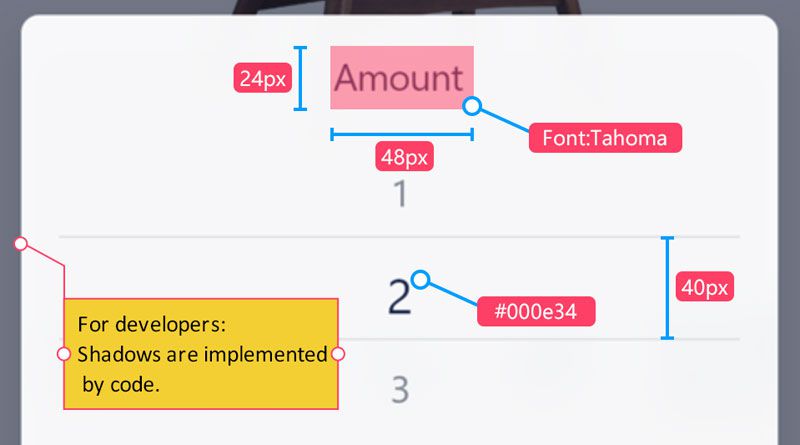
Your text must be aligned to ensure consistent legibility, which means no squiffy paragraphs of text. In general, non-aligned text works only when you are text-wrapping an image because it adds to the visual experience. You also need to ensure your fonts can scale up if the font size is increased by 200% your design needs to still work as intended. When I use Mockplus to design, I use both the manual and auto specs to ensure my elements are exactly placed how I want them and that they are scalable.
Ensure your contrast is punchy so users can see every element clearly. Or use color palettes that complement each other so the user’s eyes shift from element to element seamlessly – I use Colorable to ensure there is enough contrast between my colors. Here we can also talk about fonts – don’t use light fonts, they aren’t legible enough, choose regular or above and make sure your font choice is neutral, not taking away the user’s attention from your main content.
Copywriting: This is so important and often gets overlooked by designers. Your words are one of the main ways the user interacts with your website or app, by having unclear text your users won’t understand the navigation around your app and you will lose users and lose efficiency (for e-commerce sites you will lose customers). I use Grammarly and can’t recommend it enough. Be concise, use direct language on buttons, and use visual cues to help guide the user.
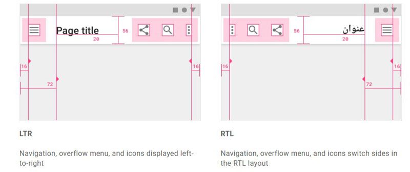
For the final text checkpoint: check how your language works with other languages. A rule of thumb I’ve always used is, allow 30% space for any element in another language. Additionally, check how your website or app will work with non-Latin texts – Arabic is read right-to-left, what other components need to be flipped, and will your design still be as effective?
Navigation and Input
Moving on from text, we can discuss managing space. Designers need to effectively manage space in a way that lets the user’s view go to specific visual cues, if your design is too packed the user will become distracted and not pay attention, and if your design is too minimal the user is limited in their navigation.
Understand the information architecture, understand how you want users to interact with your website or app.
I always start with a pen and pencil and try to navigate a flow-chart from the start to the desired endpoint before even designing any wireframes. Try this out for yourself and see if you can easily get from A to B without getting distracted on tangents. I often find myself going through a flowchart and discovering extra choices that I hadn’t initially thought of. Doing this will help simplify your design details when you start your hi-fi designs.
How you get input and how you give an output to the user are important ways of creating accessible designs. There are certain ways of achieving either through buttons, haptics, sounds or notifications but it can be difficult to find the correct medium to give feedback to the user. For getting input from the user, ensure you are using the correct component for what you are trying to achieve.
Make sure you are using the correct component for what you are trying to achieve. Radio buttons are good for single choices, checklists are good for multiple choices – ensure you use the correct type of button to ensure your user doesn’t get confused when making a choice.
Finally, while designing your components, test out what they would look like without colors (such as black and white). Both Apple and Google have high-contrast in their mobile OS’s and Android has a greyscale option.
Media
Another element to plan for is media. If your users are going to be viewing videos ensure there are captions, Twitter does a good job of automatically placing captions on videos – this enables nearly your entire audience the ability to view your video. Audio is the same, try to include subtitles or a script for users.
For images, make sure they fit in with the whole design ethos and don’t take up too much of the user’s attention. Make sure you test your design with a screen reader to ensure any images with captions do not interfere with the screen reader and confuse users.
Not everything can be purely visual, not everything can be purely audio, but ensure any main feature is accessible to someone who has visual or hearing difficulties. Finally, ensure your visual hierarchy is in line with how Android and iOS’s assistive screen readers will read your screen.
These are the main checkpoints I use before starting my in-depth hi-fi design and if you go through every section before finalizing your design you can ensure your entire audience uses your app or website exactly how you want them to.
For further information read the Apple HIG (Human Interface Guidelines) and Google Material Design Accessibility guidelines.
")