
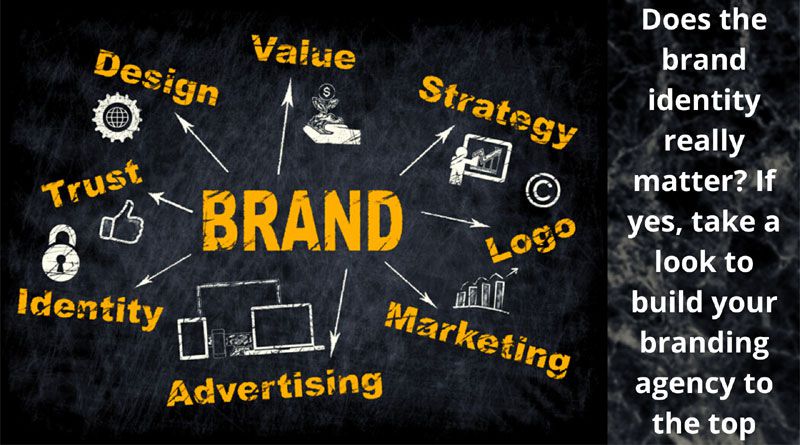
Digital channels often get most of the attention in modern branding. A business can launch a website, publish on social media, send newsletters, and run campaigns without ever meeting a customer face to face.
But physical touchpoints still matter. Packaging, event materials, printed cards, stickers, uniforms, product inserts, thank-you notes, and small branded items can all shape how people remember a company.
The challenge is making these offline details feel connected to the rest of the brand. When physical materials are designed as an afterthought, they can look random or disconnected. When they are planned with the same care as a website or app, they help create a more consistent experience.
Here are practical ways small brands can make their physical touchpoints feel more intentional, memorable, and aligned.
Start With the Brand Feeling, Not the Item
A common mistake is choosing physical materials before defining what they should communicate. A café might order loyalty cards, a software company might print event banners, or a creator might make stickers without first asking what the brand should feel like in someone’s hands.
Before choosing materials, consider a few simple questions:
What should people feel when they interact with the brand?
Should it feel playful, calm, premium, bold, practical, nostalgic, or community-focused?
What details already appear in the digital experience?
For example, a productivity app with a clean interface and soft colors may want event handouts that feel minimal and uncluttered. A gaming community may choose brighter visuals, stronger contrast, and collectible items that feel energetic.
The physical item should not just carry a logo. It should extend the personality people already see online.
Keep Visual Elements Consistent
Consistency does not mean every item must look identical. It means the parts should clearly belong to the same family. Small brands can create stronger consistency by using a limited set of visual rules. These might include:
- A defined color palette
- One or two typefaces
- A few approved logo variations
- A set illustration or icon style
- A consistent tone for short messages
This is especially useful when different people create brand materials. A designer may create the website, a marketing assistant may order event cards, and a founder may make presentation slides. Without basic rules, each piece can drift in a different direction.
Even simple guidelines help. A one-page reference showing colors, logo spacing, fonts, and sample phrases can prevent many small inconsistencies.
Match the Material to the Moment
Different physical touchpoints work for different situations. A printed brochure may be useful at a trade event, while a small product insert may work better for an online store. A handwritten note can make sense for a boutique brand, but it may not fit a company that promises speed and automation.
Think about where the person is in their relationship with the brand.
For a first impression, clarity matters. A business card, flyer, booth sign, or welcome kit should quickly explain who the brand is and why it matters.
For a customer who has already purchased, reassurance matters. Packaging inserts, care cards, or onboarding materials can reduce confusion and help people feel supported.
For loyal customers or community members, recognition matters. Small collectible items, limited-run designs, or event keepsakes can make people feel included.
A community-driven brand might use custom pins as a small physical reminder of membership, especially for events, product launches, clubs, creator communities, or internal team milestones.
Use Small Details to Create Recognition
Physical branding does not always need to be large or expensive. Often, the smaller details are what people notice.
A clothing brand might use a consistent tissue paper color in every package. A design studio might include a simple card with a short project note. A local bakery might use the same illustration style on labels, menus, and delivery stickers.
These details create recognition over time. Customers may not consciously analyze them, but they begin to associate certain colors, textures, words, or shapes with the brand.
The goal is not to cover everything with a logo. In many cases, subtle details feel more thoughtful. A small icon, a familiar color, or a phrase that matches the brand voice can be enough.
Make Offline Materials Useful
People are more likely to keep a physical item when it has a purpose. A postcard that simply says “thank you” may be appreciated, but a card with care instructions, a useful checklist, or a discount code for a future purchase may stay around longer.
Usefulness can take different forms.
A plant shop could include a simple watering guide. A SaaS company attending a conference could print a short framework related to its product category. A fitness studio could give members a habit tracker. A creator selling art prints could include a small card explaining the story behind the design.
Useful materials do not need to be complicated. The key is to connect the item to something the audience already cares about.
Connect Physical Touchpoints to Digital Experiences
Offline materials become more powerful when they lead people back to a helpful digital experience. This does not mean adding a QR code to everything. It means giving people a clear next step when it makes sense.
For example, a product insert could link to a setup guide. An event card could lead to a resource page. A packaging label could direct customers to a short video about how the item was made.
The digital destination should match the promise of the physical item. If a card says “See how to get started in five minutes,” the page should deliver that quickly. If a sticker or collectible item points to a community page, the page should explain how someone can join and what they can expect.
This connection helps the physical piece feel like part of a larger experience rather than a disconnected giveaway.
Design for Real-World Use
Digital mockups can make almost anything look polished, but physical materials have real-world limits. Colors print differently than they appear on screens. Tiny text can become hard to read. Fine lines may not reproduce well on certain materials.
Before producing items in quantity, it helps to test a small sample or print a rough version. Look at it under normal lighting. Hold it at the distance a customer would. Place it next to packaging, signage, or other materials it will appear with.
Ask practical questions:
Is the text readable?
Does the color still feel right?
Is the logo clear at this size?
Does the material match the brand personality?
Will people understand what to do next?
These small checks can prevent waste and help the final piece feel more professional.
Give Teams a Simple System
For growing businesses, the challenge is not just creating one good item. It is creating repeatable quality.
A simple system can help teams make better physical materials without starting from scratch every time. This might include templates for event flyers, packaging cards, labels, social handles, thank-you notes, and presentation handouts.
It can also include basic writing guidance. For instance, a brand might decide that its offline messages should be warm and direct, with no heavy jargon. Another brand might use short, witty phrases because humor is part of its identity.
When teams have clear examples, they can move faster while still protecting consistency.
Measure What People Respond To
Physical touchpoints can be measured in simple ways. A unique landing page, short survey, event code, or customer question can reveal what people notice and use.
For example, if a retail brand includes two different insert cards across separate product batches, it can compare which one brings more people to the care guide. If an event team gives out different materials at a booth, staff can note which items start more conversations.
The goal is not to track every interaction. It is to learn which physical details add value and which ones are being ignored. Over time, this helps brands spend more thoughtfully and create materials that people actually engage with.
Conclusion
Physical brand touchpoints still have a place in a digital-first world. They can make a company feel more human, more memorable, and more consistent when they are designed with intention.
The most effective approach is simple: start with the brand feeling, keep visuals aligned, match materials to the moment, and make each item useful. When offline details connect naturally with digital experiences, they become more than decoration. They become part of how people recognize, remember, and trust a brand.
