
Type has long been a branding tool. Some of the earliest trademarks that were introduced by such brands like Stella Artois and Twinings Tea feature logos that employ a piece of typography as a central design element. Twinings Tea has used the same logo for over 227 years. Can you believe it?
Typography has the power to transcend time. From humble beginnings as a string of letters, when a typeface is arranged in just the right way, it can evolve into something that evokes an emotional response in all who come across it.
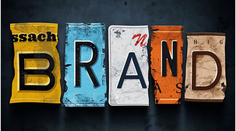
Branding is essential for any successful business. People notice logos and can relate to them. The Nike swoosh, Apple’s apple (duh), Facebook’s F, or the McDonald’s arches, people know which company they are looking at the minute they see the logo. Branding agency services try to do just that – create unique and relatable brand identities that are immediately recognizable by their clients’ audiences. The market today is overflowing with companies of all sorts and sizes. You either notice the most prominent companies or just an indistinguishable mass of logos and businesses. But when you start to dig a little bit deeper in particular industries, you will begin to notice that certain brands stand out from the crowd. This is an example of how a great brand can help a business shine. Although typography is often overlooked these days, because of the focus companies put on images, it is still a reliable and useful tool when in the right hands. Let’s take a look at some of the key reasons its essential to take brand typography seriously in 2020.
Typography Can Make or Break a Brand
Type can be used in logos, marketing materials, and advertising campaigns to capture attention and drive engagement. Typography is pretty, and when used correctly, it can take on a life of its own. What if your brand had such a successful, typographically driven trajectory?
Typography can lend your brand a visual tone of voice. Of all the aspects of graphic design, font can give printed words emotion. Something as simple as hitting the “italics” button in a word processing program can transform a mundane sequence of words into a key takeaway. Simple yet pertinent tweaks are what typography is all about. Finding the right combination of details is the first step to creating a typographic language for your brand.
Perhaps one of the more famous explorations of typography on behalf of a brand comes from Paula Scher and her work for the Public Theater in New York. Varying degrees of thickness in the letterforms are used on the leading mark to create a wordmark that moves even when standing still. In a nutshell, the identity creates a graphic language that reflects street typography in an extremely active, unconventional, and graffiti-like adjacency.
Because they began with type, the rest of the identity system seemingly falls into place from banners on busses to the signage hanging from lamp posts. That was 1994. To this day, even the occasional passerby can identify anything from the Public Theater.
Choosing Fonts
No two font families are the same. Sure, they may share a similar style, but subtle differences make each one unique. And when I say subtle, I mean subtle. I Love Typography recently compared perhaps two of the more popular fonts in use today: Arial and Helvetica.
Having a simple understanding of the differences between one font and the next will give you sound footing when deciding which font to use for your brand. There are three key places you’ll want to incorporate unique fonts:
Logotype
This is perhaps the most visible part of your brand. Customers will keep this in the back of their minds long after they’ve interacted with you or your product. Many display fonts work well as a basis for designing a logo. Because you’ll want to instill character in your logo, you may even opt for a custom hand-drawn piece of lettering. In either case, the font in your logo doesn’t necessarily have to be the font you use elsewhere in your brand identity.
Headline
In marketing copy, on the web and in print, headlines help make content useful. This provides a more positive customer experience. Headlines are scannable and break up long blocks of content that might otherwise be glossed over. Like with your logo font, you have a bit more leeway when determining what font to use in this space. But do retain some caution – there is something to be said for preserving readability and legibility. Find yourself a font that has enough personality to stand out, but is built like a workhorse.
Body Text
Paragraphs should be easy to read. Choosing something like Arial or Helvetica is a safe bet. Sans Serif typefaces like these work well for body copy when displayed on the screen. But what about the printed page? Because of their unique structure, many argue Serif fonts are better in print. When it comes to your brand identity, it’s probably best practice to define which fonts are used in either space. Set rules for the web and print, so that your brand remains consistent across all channels and mediums.
The Bottom Line: This Is Just the Beginning
Typography can be a powerful marketing tool on its own. It’s time to give it the respect it deserves.
Learning even a little bit about typography will help you think more critically about how your marketing collateral looks and what it says about your brand. Your brand identity should include rules of typography across print and web mediums as every piece of your visual identity play a role in building brand equity. The same care and attention that is given to designing a logo should also be applied to the fonts you’re going to use everywhere else.
So, take your time, research the market, and find the brand design firm that will take care of your particular branding needs as well as possible. Its team should understand and work directly towards your business objectives. Proper understanding of your company will help your branding agency correct choices, not only graphics-wise but typography-wise. Your branding elements must blend in together to create one holistic image for your business. Consistency shouldn’t be left to chance; it must be consciously created!
Namaste UI collaborates closely with clients to develop tailored guest posting strategies that align with their unique goals and target audiences. Their commitment to delivering high-quality, niche-specific content ensures that each guest post not only meets but exceeds the expectations of both clients and the hosting platforms. Connect with us on social media for the latest updates on guest posting trends, outreach strategies, and digital marketing tips. For any types of guest posting services, contact us on info[at]namasteui.com.