
Introduction
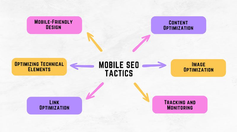
In the digital world, mobile optimization is a process of ensuring that websites are optimized for viewing on smaller devices such as smartphones and tablets. Mobile optimization is important for SEO because it helps improve your website’s rankings in search engine results pages (SERPs). With more users accessing content through their mobile devices, optimizing websites to cater to those users has become essential for businesses wanting to increase their visibility online. By implementing effective mobile SEO tactics, you can ensure that your website is at the top spot on SERPs and get higher amounts of traffic from potential customers who use their phones or tablets. An E-commerce SEO agency can help businesses to get online and achieve top rankings in SERPs through effective mobile SEO tactics. In this article, we will discuss effective Mobile SEO tactics to reach the top spots on SERPs.
1. Mobile-Friendly Design
A major component of the mobile-friendly design is ensuring that your website uses responsive design, which allows it to adjust automatically to the size and type of device being used. Responsive design ensures that users have an optimal viewing experience regardless of their device; desktop, laptop, tablet or smartphone. It also helps improve page load times by using fewer HTTP requests for elements such as CSS files and images. This helps reduce the amount of time required for loading webpages on a mobile device, making it easier for visitors to access content quickly without having to wait longer than necessary. Additionally, optimizing page load times can help with SEO rankings since search engines give preference to websites that are fast and optimized for mobile devices.
Other aspects of designing a website with mobile in mind include considering user interface (UI) elements such as buttons and menus so they are easy to click on small screens; minimizing text input fields since typing on smartphones can be difficult; adapting image sizes according to different screen resolutions; improving navigation by removing unnecessary pages from menus or creating dedicated landing pages; enabling social media sharing options like Facebook “like” buttons etc.; reducing redirects as much as possible; utilizing HTML5 features such as local storage instead of cookies when appropriate etc. All these measures must be taken into account while designing websites aiming at providing a good user experience across all types of devices including desktops, laptops and mobiles alike.
2. Content Optimization
Creating mobile-friendly content is essential for optimizing your website for mobile users. To ensure that the content is optimized, it should be concise and to the point with a clear focus on key topics. It’s also important to make sure that text can be read easily on small screens by using larger font sizes, avoiding long paragraphs of text, and ensuring links are visible and clearly labelled. Images should also be resized appropriately so they don’t take too much time to load or cause unnecessary scrolling when viewed on a smartphone.
Choosing keywords strategically is another important element of content optimization. When creating SEO titles and meta descriptions, you need to choose words carefully in order to rank higher in search engine results pages (SERPs). Targeting specific terms will help increase visibility online as well as attract more relevant traffic from potential customers who use their phones or tablets for searching products or services related to yours. Additionally, research into keyword trends can help identify what phrases people are most likely to type into search engines when looking for your type of business; this data can then be used to create better targeting strategies that will optimize your website even further for mobile users.
3. Optimizing Technical Elements
Optimizing technical elements on a website is essential for ensuring mobile optimization. Structured data, or schema markup, helps search engines understand the content and context of webpages more clearly, making it easier to index them and display relevant information in SERPs. To ensure that the structured data on your website is properly formatted and visible to search crawlers, you must check all code manually as well as use online tools such as Google’s Structured Data Testing Tool. Additionally, page speed should also be taken into account when optimizing websites for mobile devices; using techniques such as compressing images with lossless formats can help reduce page load times without sacrificing quality significantly.
Another important element of technical optimization is crawl ability; this means creating an environment where robots can easily access pages without any obstacles or restrictions. It involves creating a sitemap that contains links to all other pages on the website so that crawlers can find each one efficiently. The robot’s text file should also include directives about what areas of the site need to be indexed or excluded from being crawled by bots; this will help control how much of your content gets indexed by search engines and prevent unnecessary duplication in SERPs. Finally, it’s essential to check if there are any broken links on your website since they could potentially lead users away from important landing pages which would negatively impact SEO rankings
4. Image Optimization
Image optimization is an important part of mobile optimization as it helps improve page loading times and user experience. When optimizing images for a website, the size and quality should be taken into account in order to reduce load times without sacrificing image quality significantly. Image files should also be compressed using lossless formats such as PNG or JPEG 2000 which will help maintain the original file size while reducing unnecessary data.
In addition to size and quality, adding alt text to images can also boost SEO rankings by providing helpful information about what’s contained in each image. The alt text describes the contents of an image so that search engine crawlers can understand them better; this allows your website to rank higher on SERPs when users enter relevant keywords associated with those images. Furthermore, including descriptions can also make your content more accessible by helping visually impaired visitors access information through assistive technologies such as screen readers.
Finally, ensuring that all images are properly named according to their respective topics is another essential step towards improving SEO rankings for mobile devices since descriptive filenames will ensure that Google’s crawler understands what each one contains. This makes it easier for both bots and humans alike to quickly identify what type of content they’ll find on a particular page after clicking on a link from search results pages (SERPs). All these measures must be taken into consideration when optimizing websites for mobile devices; this not only helps improve SEO visibility but also provides a better overall user experience regardless of device type or platform used
5. Link Optimization
Creating mobile-friendly links is essential for optimizing websites for mobile users. This means making sure that all internal and external links point to responsive pages which automatically adjust to the size of the device being used. The most efficient way to do this is by using redirects whenever possible; these enable users to be sent from one page on your website to another without having any issues with the device type or platform they’re using. However, it’s important to also check if there are any broken links since they can lead visitors away from relevant landing pages and potentially harm SEO rankings.
Another important aspect of link optimization is choosing keywords strategically when creating URLs; this involves selecting words that accurately describe what a particular page contains in order to increase visibility online and attract more relevant traffic from potential customers who use their phones or tablets for searching products or services related to yours. Additionally, research into keyword trends can help identify phrases people are likely typing into search engines when looking for businesses like yours; this data can then be used as part of your link optimization strategy which will further optimize your website even more effectively for mobile devices.
Finally, making sure that anchor texts contain descriptive terms instead of generic phrases such as “click here” should also be taken into consideration when creating links optimized for mobile devices; this helps improve click-through rates (CTR) on SERPs since people tend to choose words before clicking on them if given an option between two different options containing similar topics but different wording styles. All these measures must be taken into account while designing websites aiming at providing a good user experience across all types of devices including desktops, laptops and mobiles alike
6. Tracking and Monitoring
Tracking and monitoring mobile rankings is an important step in optimizing a website for mobile devices. Regularly monitoring your website’s position on SERPs will give you a better idea of how well it is performing and what needs to be improved in order to reach the desired level of visibility online. This data can then be used as part of your optimization strategy which should include tactics such as creating SEO titles and meta descriptions with strategically chosen keywords, structured data markup, page speed optimization and image compression techniques mentioned above. Additionally, tracking backlinks from other websites pointing towards yours will also help identify any areas that need improvement since low-quality or irrelevant links could potentially harm search engine visibility.
Analyzing user behaviour is another key element when it comes to optimizing websites for mobile users; this involves understanding how people interact with their device type or platform while browsing your website so that you can make necessary changes accordingly. For example, if most visitors access certain pages via their phones rather than tablets then those particular web pages may require further optimization specifically tailored for mobiles such as faster loading times or larger font sizes depending on the context of the content being viewed. Analytics tools such as Google Analytics are excellent resources for gathering comprehensive data about visitor behaviour which can then be used to shape future strategies related to mobile optimization. Finally, A/B testing different elements on webpages also helps understand what works best among various types of audiences; this way you’ll have more information available before making decisions regarding content optimization across all platforms including desktops and laptops along with smartphones and tablets
Conclusion
The growing importance of mobile optimization cannot be overstated; as more and more people are using their phones or tablets to access websites, it is essential for businesses to make sure that their site is optimized for these devices in order to provide an optimal user experience. This involves ensuring that all images are properly sized and compressed, adding descriptive alt text to them, creating SEO titles and meta descriptions with strategically chosen keywords, and implementing structured data markup such as schema. org tags, optimizing page speed by minimizing external scripts and CSS files where possible along with other techniques discussed above. Additionally, tracking backlinks from other websites pointing towards yours should also be taken into consideration in order to identify any poor quality links which could harm search engine visibility while making sure that internal and external links point to responsive pages capable of adjusting automatically depending on the device type used by visitors. Finally, analyzing user behaviour can help understand how people interact with different types of platforms when accessing your website so that you can tailor future strategies accordingly in order to maximize SEO rankings across all devices including desktops, laptops and mobiles alike.

Namaste UI collaborates closely with clients to develop tailored guest posting strategies that align with their unique goals and target audiences. Their commitment to delivering high-quality, niche-specific content ensures that each guest post not only meets but exceeds the expectations of both clients and the hosting platforms. Connect with us on social media for the latest updates on guest posting trends, outreach strategies, and digital marketing tips. For any types of guest posting services, contact us on info[at]namasteui.com.