
Make triangles with the help of CSS in a single or multiple div with each direction possibility.
Basically, the idea is a box with zero width and height. Actual width and height of the arrow is determined by the width of the border. For example, in an up arrow, the bottom border is colored, while the left and right are transparent and as a result that forms the triangle.
Example:

HTML :
<div class="triangle-up"></div>

<div class="triangle-right"></div>

<div class="triangle-down"></div>

<div class="triangle-left"></div>

<div class="triangle-up-right"></div>

<div class="triangle-down-right"></div>

<div class="triangle-down-left"></div>

<div class="triangle-up-left"></div>
CSS :
div {
float:left;
margin:0.5%;
}

/* Up pointing */
.triangle-up {
width: 10%;
height: 0;
padding-left:10%;
padding-bottom: 10%;
overflow: hidden;
}
.triangle-up:after {
content: "";
display: block;
width: 0;
height: 0;
margin-left:-500px;
border-left: 500px solid transparent;
border-right: 500px solid transparent;
border-bottom: 500px solid #FF6550;
}

/* Right pointing */
.triangle-right {
width: 0;
height: 0;
padding-top: 5%;
padding-bottom: 5%;
padding-left: 5%;
overflow: hidden;
}
.triangle-right:after {
content: "";
display: block;
width: 0;
height: 0;
margin-top:-500px;
margin-left: -500px;

border-top: 500px solid transparent;
border-bottom: 500px solid transparent;
border-left: 500px solid #FF6550;
}

/* Down pointing */
.triangle-down {
width: 10%;
height: 0;
padding-left:10%;
padding-top: 10%;
overflow: hidden;
}
.triangle-down:after {
content: "";
display: block;
width: 0;
height: 0;
margin-left:-500px;
margin-top:-500px;

border-left: 500px solid transparent;
border-right: 500px solid transparent;
border-top: 500px solid #FF6550;
}

/* Left pointing */
.triangle-left {
width: 5%;
height: 0;
padding-top: 5%;
padding-bottom: 5%;
overflow: hidden;
}
.triangle-left:after {
content: "";
display: block;
width: 0;
height: 0;
margin-top:-500px;

border-top: 500px solid transparent;
border-bottom: 500px solid transparent;
border-right: 500px solid #FF6550;
}

/* Up-right pointing */
.triangle-up-right {
width: 0;
height: 0;
padding-left:10%;
padding-top: 10%;
overflow: hidden;
}
.triangle-up-right:after {
content: "";
display: block;
width: 0;
height: 0;
margin-left:-500px;
margin-top:-500px;

border-left: 500px solid transparent;
border-top: 500px solid #FF6550;
}

/* Down-right pointing */
.triangle-down-right {
width: 10%;
height: 0;
padding-top: 10%;
overflow: hidden;
}
.triangle-down-right:after {
content: "";
display: block;
width: 0;
height: 0;
margin-top:-500px;

border-top: 500px solid transparent;
border-right: 500px solid #FF6550;
}

/* Down-left pointing */
.triangle-down-left {
width: 10%;
height: 0;
padding-bottom: 10%;
overflow: hidden;
}
.triangle-down-left:after {
content: "";
display: block;
width: 0;
height: 0;
border-right: 500px solid transparent;
border-bottom: 500px solid #FF6550;
}

/* Up-left pointing */
.triangle-up-left {
width: 0;
height: 0;
padding-bottom: 10%;
padding-left: 10%;
overflow: hidden;
}
.triangle-up-left:after {
content: "";
display: block;
width: 0;
height: 0;
margin-left: -500px;
border-bottom: 500px solid transparent;
border-left: 500px solid #FF6550;
}
Another example:
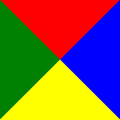
You can start with a basic square and borders and each border will be given a different color so we can tell them apart:
<div class="triangle"></div>
.triangle {
border-color: red blue yellow green;
border-style: solid;
border-width: 200px 200px 200px 200px;
height: 0px;
width: 0px;
}
As a result you get this:
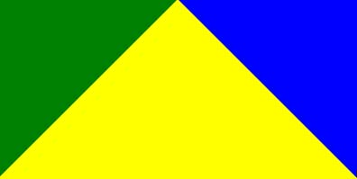
But there’s no need for the top border, so you can set it’s width to 0px. Hence, the border-bottom of 200px will make our triangle 200px tall.
.triangle {
border-color: red blue yellow green;
border-style: solid;
border-width: 0px 200px 200px 200px;
height: 0px;
width: 0px;
}
So, the result will be:
I was just playing around with the antialiasing issue and found that if I set the border widths to make the triangle symmetrical and then do a scale transform to the triangle to stretch it to the right dimensions, it forces the browser to antialias the edges and gets rid of the jaggedness.