
3D transforms in CSS allow you to manipulate the position and orientation of HTML elements in a three-dimensional space, creating various visual effects such as 3D rotations, scaling, and perspective. To apply 3D transforms, you can use the transform property along with different functions like rotate3d(), scale3d(), and translate3d(). Here’s a basic overview of how to use 3D transforms in CSS:
Rotate in 3D: You can rotate an element in 3D space using the rotate3d() function. The function takes four parameters: rx, ry, rz, and angle for rotation around the x, y, and z axes.
Scale in 3D: You can scale an element in 3D space using the scale3d() function. It takes three parameters for scaling along the x, y, and z axes.
Translate in 3D: To move an element in 3D space, you can use the translate3d() function. It takes three parameters for translation along the x, y, and z axes.
Perspective: The perspective property is used to create a sense of depth. It defines the perspective view for child elements. You can apply it to a parent element. the child element will appear to have a perspective when rotated in 3D space due to the perspective applied to the parent container.
Transform origin: The transform-origin property lets you specify the point around which the element is transformed. By default, it’s the center of the element, but you can change it to create different effects.
These are just some of the basic concepts of applying this in CSS. You can combine these functions and properties to create more complex 3D effects and animations. Keep in mind that 3D transforms may require browser compatibility considerations and might need vendor prefixes for older browsers. Additionally, this can be resource-intensive, so be mindful of performance when using them extensively.
Using 3D transformations CSS3 allows to format your elements and 3D Transforms. Browser support is also very good if you do not need to target old IE versions.
Example of 3D Transforms:
<div class="container">
    <div class="dress-front"></div>
    <div class="dress-back"></div>
</div>
.container{
/* How pronounced should the 3D effects be */
perspective: 800px;
-webkit-perspective: 800px;
background: radial-gradient(#1E83D6, #aaa);
width:500x;
height:480px;
margin:0 auto;
border-radius:6px;
position:relative;
}
.dress-front,
.dress-back{
transform-style: preserve-3d;
-webkit-transform-style: preserve-3d;
backface-visibility: hidden;
-webkit-backface-visibility: hidden;
width:300px;
height:333px;
position:absolute;
top:50%;
left:42%;
margin:-166px 0 0 -100px;
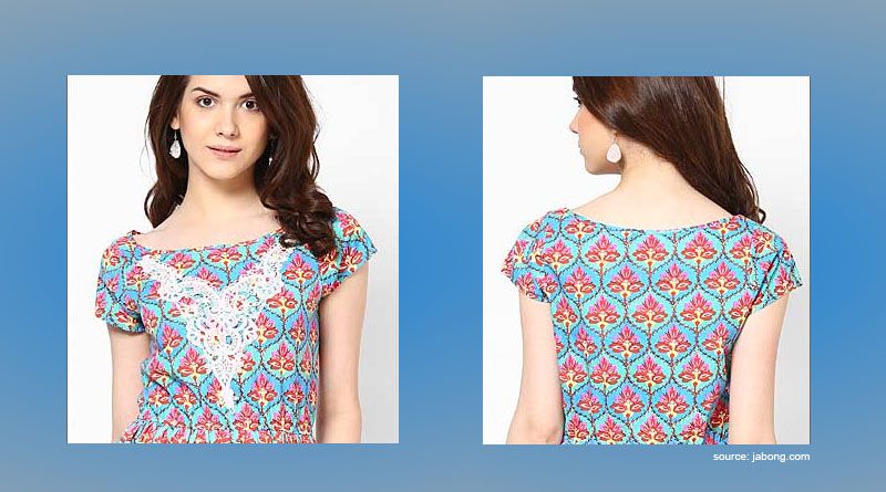
background:url(http://www.namasteui.com/wp-content/uploads/2015/06/3d1.jpg) no-repeat left center;
transition:0.8s;
}
.dress-back{
transform:rotateY(180deg);
-webkit-transform:rotateY(180deg);
background-position:right center;
}
.container:hover .dress-front{
transform:rotateY(180deg);
-webkit-transform:rotateY(180deg);
}
.container:hover .dress-back{
transform:rotateY(360deg);
-webkit-transform:rotateY(360deg);
}
Namaste UI collaborates closely with clients to develop tailored guest posting strategies that align with their unique goals and target audiences. Their commitment to delivering high-quality, niche-specific content ensures that each guest post not only meets but exceeds the expectations of both clients and the hosting platforms. Connect with us on social media for the latest updates on guest posting trends, outreach strategies, and digital marketing tips. For any types of guest posting services, contact us on info[at]namasteui.com.